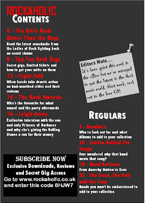
This is a brief and basic draft of my music magazines contents page. The circle at the top left hand corner will be a plug for a gig.
The photo will be one that I've already taken with a brief subheading and text in the bottom left hand corner.
Once I have written the article for the double page spread I will start putting in the contents subheadings and the subheadings and headlines on the front cover.
Like in the Kerrang! magazine contents page there will be a minimalist colour scheme and the background will be in white. The subheadings will be in red with descriptions in black. The text in the description of the photo will be a light colour depending on the colours of the photo used.
Draft #1

I've begun to plan with the text and images that may be used in the final draft. The editors note is a convention I found in some of the research on contents pages which I thought would be a way to appeal and attract my audience as it is directed at the reader. None of the articles are listed in the contents page headings yet. This was done on Publisher because I found it easier to work with at the time than Photshop. The image was edited on Photoshop however.
The black box in the bottom left hand corner is to appeal to the audience as it is an advertisement for the subscription of the magazine. On the NME contents page for example, I found an advert for the reader to subscribe to the magazine.
Draft #2

The background colour of the contents page is the same as the colour of the background of my front page. This is to show continuity in my magazine. The headings and subheadings are conventions that I found in my research. The page numbers are also conventions and tell the reader where specific articles are. There is too much space at the moment but there will be some images featured on the contents page.
The font style of the editor's note is to look like handwriting so it would look more personal and the pin is to add to this effect so it looks as if its been pinned onto the contents page.
Final Draft
I changed the background colour because I thought the colours stood out better with a white background. The images are edited on Photoshop then resized and adjusted on Publisher. The photos are tilted to look disjointed and messy instead of straight like other contents pages. This is to defy the normal convention of images on contents pages to seem original.

No comments:
Post a Comment